05 Visualization
Introduction
-
Visualization use of computer-generated, interactive, visual representations of data to amplify cognition finding artificial memory that best supports our natural means of perception
- visualizations are for humans (take advantage of human visual perception system)
Visualize, then quantify!
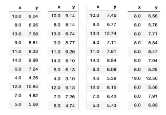
- all four dataset have the same mean, standard deviations, and correlation \(\rightarrow\) same regression line!
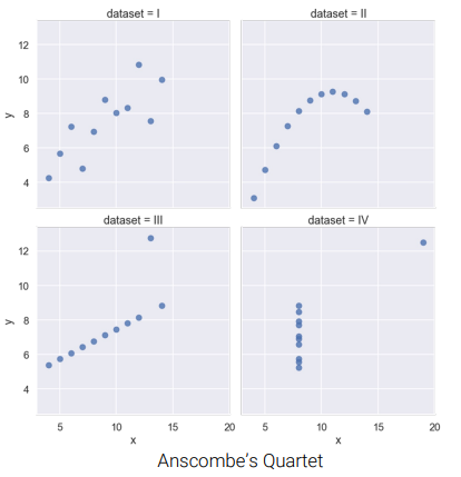
- yet their graph look very different
- \(\Rightarrow\) Visualization complements statistics
- Goal of Data Visualization
- To help your own understanding of data/results
- key part of EDA, useful throughout modeling
- To communicate results/conclusions to others
- minimize explanations
- Inform human decisions
- every visualizations have tradeoffs
Encoding
- encoding: \(variable \longrightarrow\)
map\(visual\) \(element\)
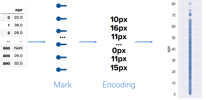
mark: represents a datum
\(Q\) : How many variables are we encoding here?
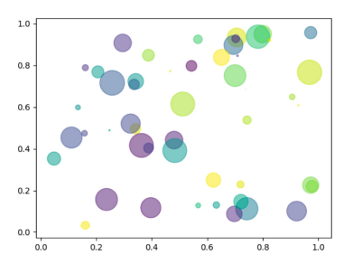
Answer
- \(4\) variables
xy- area
- color
\(Q\) : What is wrong with this visualization?
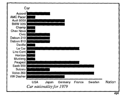
Answer
- incorrect use of bar chart
- qualitative data used (
Nationality) instead of quantitative - \(\Rightarrow\) not all encoding channels are exchangeable
Distribution
-
distribution : describes frequency at which values of variable occur
- show percentages (distrubtion) of category
- all values must be accounted for once and only once
\(Q1\) : Does this chart show a distribution?
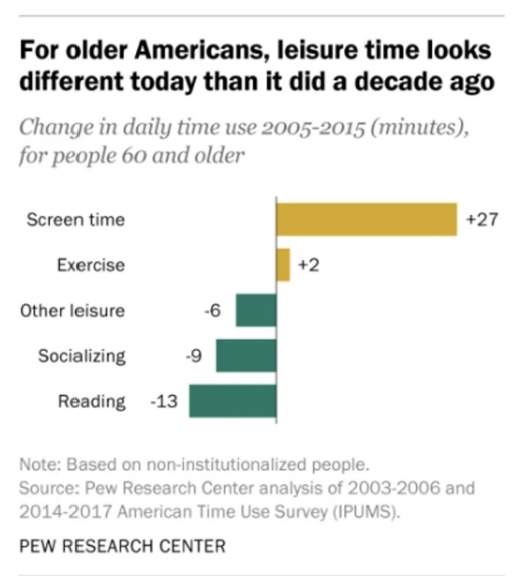
Answer
-
NO - individuals can be in more than one category
- numbers and bar length correspond to time, not proportion or number of individuals in category
-
\(Q2\) : Does this chart show a distribution?
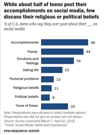
Answer
-
NO - does show percentages of individuals in different categories
BUTindividuals can be in more than one category
-
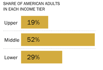
\(Q3\) : Does this chart show a distribution?
Answer
-
YES! - shows the distribution of the qualitative ordinal variable “income tier.”
- Each individual is in exactly one category
- The values we see are the proportions of individuals in that category
- Everyone is represented, as the total percentage is 100%.
-
Type of Visualizations
Bar plots
- most common way for qualitative (categorical) variable
also works for numerical variables on different categories
not a distribution, but still makes sense
length encode values
- width = nothing
- colors = may indicate sub-category
Ways to plot:
- matplotlib
plt:basis of all three - pandas
.plot():can make default plots - seaborn
sns:allow sophisticated visualizations quickly
- matplotlib
births['Maternal Smoker']= series of boolean valuesbirths['Maternal Smoker].value_counts().plot( kind = 'bar' )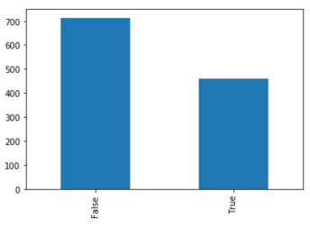
sns.countplot( births['Maternal Smoker'] )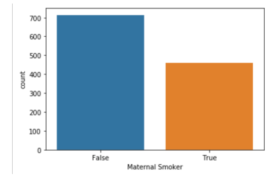
- list of majors and list of corresponding GPA
plt.bar( majors, gpas )(horizontal: changebar\(\rightarrow\)barh)sns.barplot( majors, gpa )
result
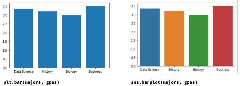
- here, the color is meaningless
Rug plots, Histograms, Density Curves
Rug Plots
- for quantitative (numerical) varibles
- shows each and every value
- issues:
- too much detail
- hard to see bigger picture
- Overplotting (ex: birthweights at 120: can’t tell, all on top of each other)
sns.rugplot(bweights)
Histograms
- smoothed version of rug plot (lose granularity, gain interpretability)
- horizontal axis \(\leftrightarrow\) : divided into bins
proportion in bin = width of bin * height of bin
- area: proportions (total area = 1 (100%))
- units of height: proprtion per unit on the x-axis
plt.hist( bweights, bins=bw_bins, ec='w')- where
bw_bins = range(50, 200, 5)
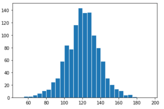
- \(\Rightarrow\) by default,
matplotlibshow counts on y-axis, instead of proportions per unit
plt.hist( bweights,density=True , bins=bw_bins, ec='w')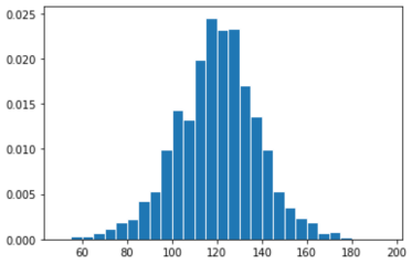
- \(\Rightarrow\) total area sums to 1 (y-axis fixed)
- where
\(Example\)
- \(\approx\)
120babies born with weight between110~115(y-axis = count) - total
1174observations (given) - looking at y-axis=proportion graph:
- width of bin [110, 115) = \(5\)
- Height of bar [110, 115) = \(0.02\)
- proportion of bin =
5*0.02= \(0.1\) - Number in bin =
0.01*1174= \(117.4\) \(\approx\)120!
- \(\approx\)
- beware of drawing strong conclusions from looks of histogram
- Number of bins influences appearance!
- Freedman-Diaconis rule: \(Bin width = 2\frac{IQR(x)}{\sqrt[\leftroot{10} \uproot{5} 3]{n}}\)
- Bins don’t need to to have the same width
- \(\Rightarrow\) especially crucial to think of proportions as areas
- \(\Rightarrow\) especially crucial to think of proportions as areas
Density Curves
- instead of discrete histogram, visualize by continuous distribution
sns.histplot(bweights,kde=True )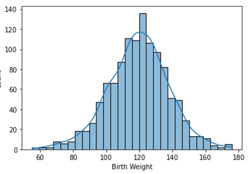
- Desity Curve only
sns.displot(bweights, kind='kde')- or
sns.kdeplot(bweights)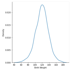
- or
Describing Quantitative Distributions
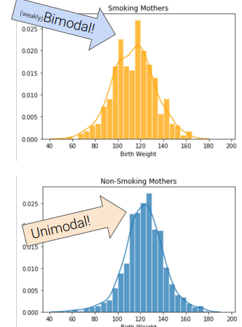
- Mode of distribution : local or global maximum
unimodal, bimodal, multimodal
Skew and Tails:
- ex) long right tail = “skewed right”
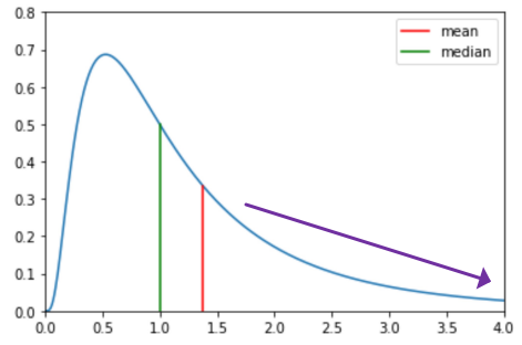
- mean : balancing point of density
- skewed right = median < mean
- symmetric: both tails are equal size
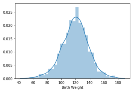
- unimodal and symmetric, roughly normal
- ex) long right tail = “skewed right”
- Outliers
Box Plots and Violin Plots
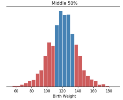
Quartiles
25th percentile: First/Lower quartile50th percentile: Second quartile (median)75th percentile: Third/Upper quartile- \(IQR\) (Interquartile Range) =
third quartile-first quartile- measures spread
Box Plots
sns.boxplot( bweigths )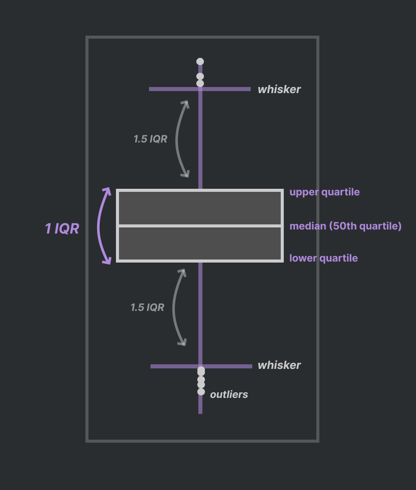
- 참고: box width means nothing
check by coding
q1 = np.percentile( bweights, 25 )
q2 = np.percentile( bweights, 50 )
q3 = np.percentile( bweights, 75 )
iqr = q3 - q1
whisk1 = q1 - ( 1.5 * iqr )
whisk2 = q4 + ( 1.5 * iqr )

whisk1, q1, q2, q3, whisk2
>>> (73.5, 108.0, 120.0, 131.0, 165.5)
Violin Plots : box-whisker + density curve
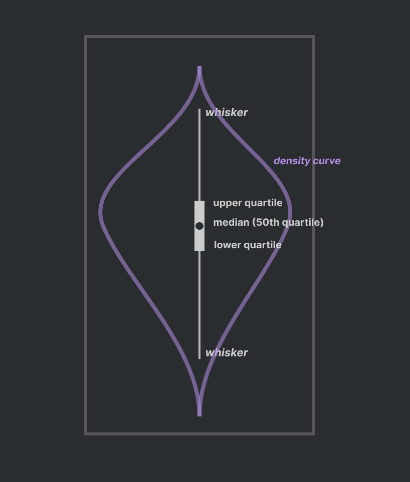
- width have meaning
Comparing Quantitative Distributions
Overlaid histograms and density curves:
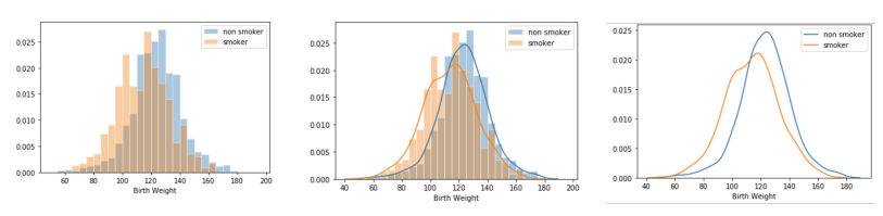
- First graph: not bad but looks like 3 seperate histograms
- Second graph: too much information and unclear
- Third: although estimates are rough, it’s the best
Side by side box plots and violin plots:
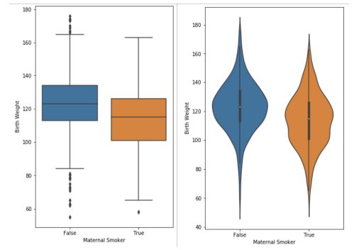
- concise, well suited side by side
- violin plot shows us bimodal nature of
Truecategory
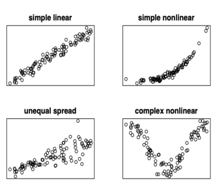
Relationships between two quantitative variables
Scatter plots: used to reveal relationship between pairs of numerical variables
help inform modeling choices
- color usage also helpful
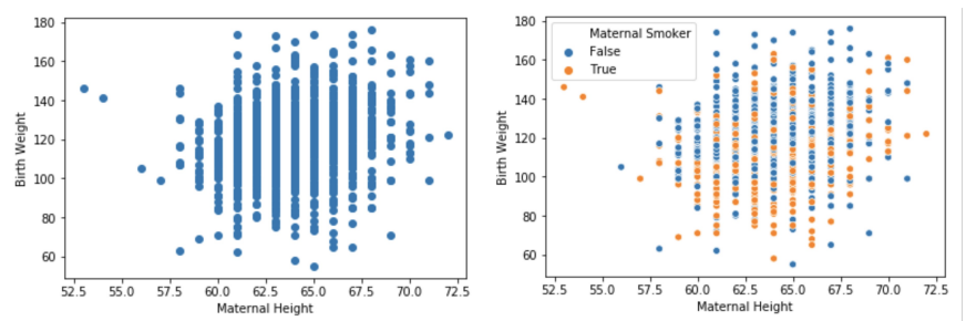
- overplotting : points on top of each other
- \(\Rightarrow\) use
random noise in bothxydirections \(\begin{bmatrix} 65 & 170 \\ 65 & 170 \\ ... \end{bmatrix} \rightarrow \begin{bmatrix} 65^{+0.2} & 170^{+0.2}\\ 65^{-0.2} & 170^{-0.2}\\ ... \end{bmatrix} \Rightarrow \begin{bmatrix} 65.2 & 170.2\\ 64.8 & 169.8\\ ... \end{bmatrix}\) - \(\Rightarrow\) change in shape, but clearer
- \(\Rightarrow\) use
sns.lmplot(data=births, x=‘Maternal Height’, y=‘Birth Weight’, ci=False)- or `sns.jointplot(data=births, x=‘Maternal Height’, y=‘Birth Weight’)`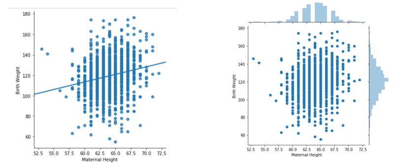
Hex plots:
- \(\approx\) 2-D histogram
- shows joint distribution
- xy plane binned into hexagons
- darker (more shaded) \(\rightarrow\) greater density/frequency
- Why hexagons ⬡ instead of squares □?
- easier to see linear relationships
- more efficient for covering region
- visual bias of squares (tend to see ver, hori lines)
sns.jointplot(data=births, x=‘Maternal Height’, y=‘Birth Weight’,kind=’hex’ )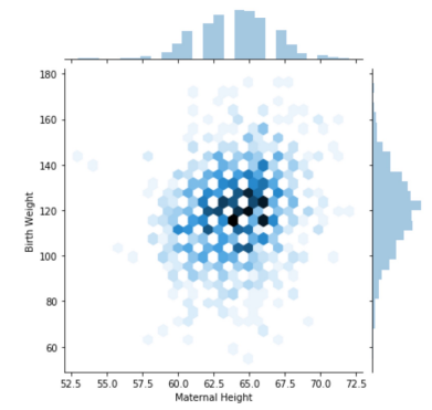
Contour plots:
- \(\approx\) 2-D versions of density curve
- default: shows marginal distributions on the horizontal and vertical axes.
- \(\Rightarrow\) histograms/density curves of each variable independently
sns.jointplot(data=births, x=‘Maternal Height’, y=‘Birth Weight’,kind=’kde’, fill=True )<img src="../DataAnalytics/DataScience/assets/5-contourplot.png" alt="example" style="height: 300px; width: auto;"/>
Principles of Visualization
Scale
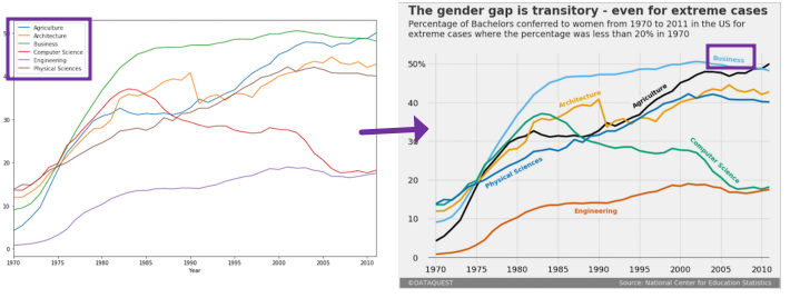
- case study: Planned Parenthood accused of selling aborted fetal tissues for profit.
- below graph presented by Congressman Chaffetz (from another report)
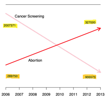
- \(\Rightarrow\) Misleading; Do not use two different scales for the same axis!
Visualization with correct scale
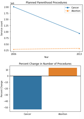 - \(\Rightarrow\) Abortions increased from 13% to 26% of total procedures.
 - below graph presented by Congressman Chaffetz (from another report)
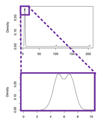
- Reveal the data
- choose axis limits to fill the visualization
- if necessary: zoom in on the bulk of data
- create multiple plots to show different regions of interest
Conditioning
case study: median weekly earnings
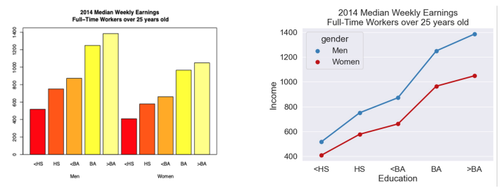
- \(\Rightarrow\) right is more clear
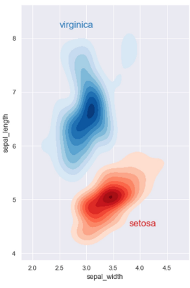
Distributons and relationships in subgroups
Juxtaposition: placing multiple plots side by side with same scale (‘small multiples’)
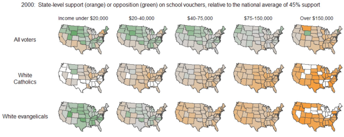
- Superposition: placing multiple densitiy curves, scatter plots on top of each other
- use color and shapes to reperesent additional variables
Perception
Colors
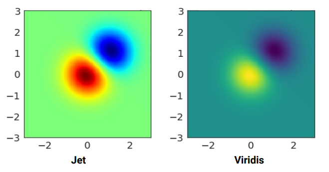
- jet:
boundary(oldmatplotlibdefault colormap) - viridis:
continuous change(currentmatplotlibdefault)
Jet/rainbow colormap misleads
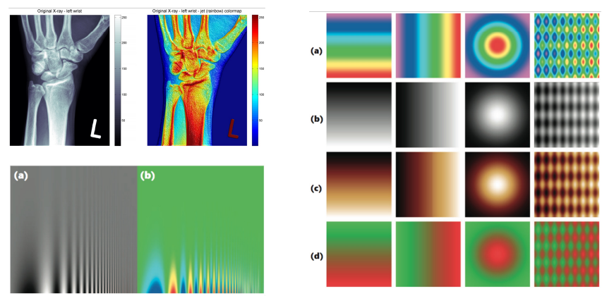
- sometimes colorless is better
Use perceptually uniform colormaps
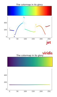
- except Google
TurboColormap (Rainbow) is actually perceptually uniform
use colors to highligh data type
- Qualitative: choose qualitative scheme that helps distinguish categories
- Quantitative: choose color scheme that implies magnitude
Sequential and Diverging
- left (sequential scheme): light color = extreme values
- right (diverging scheme): light color = middle (neutral) values
good to use color packages
- jet:
Markings
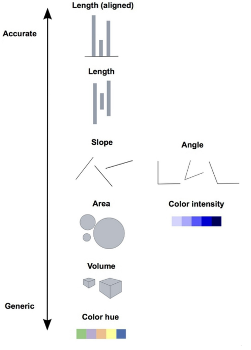
- \(\Rightarrow\) accurate preferred
- Lengths are easy to distinguish (bar graphs)
- avoid:
- angles & areas (pie charts)
- wordclouds
- jiggling baseline (stacked bar charts, area charts)
- related: Overplotting
Context
- instead of keys, better if labeled directly
- add context directly to plot
- captions: comprehensive, conclusions …etc
Smoothing
- Histograms : smoothed version of rug plots
-
Smoothing allows to focus on general structure rather than individual observations
- points :
[ 2.2, 2.8, 3.7, 5.3, 5.7 ] bins :
[0,2),[2,4),[4,6),[6, 8]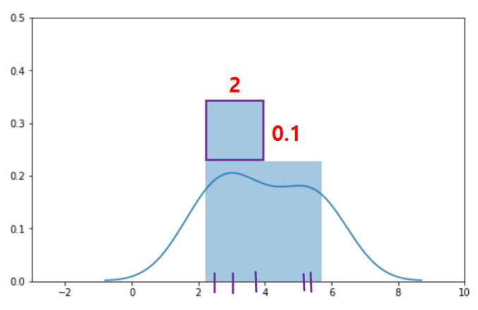
- area = proportion,
(2 * 0.1) * 5 = 1
- points :
KDE : Kernal Density Estimation
- estimate probability density function (or density curve)
- Place kernal at each data point
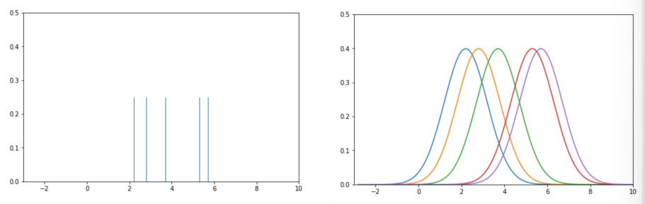
- 1.1: choose \(kernal\) and \(bandwidth (\alpha)\)
- kernal :
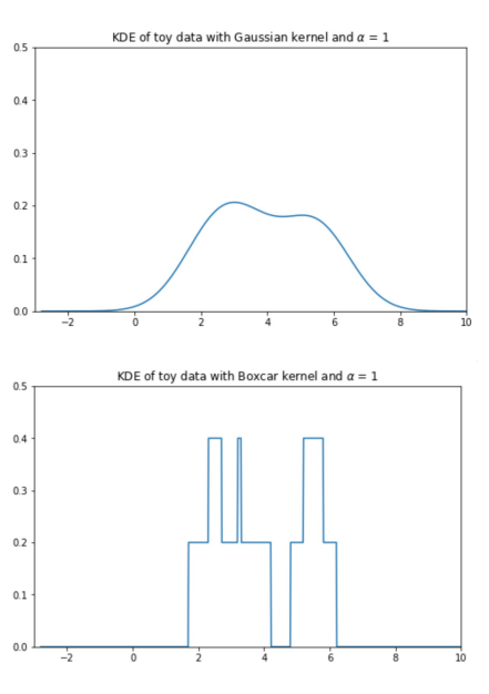
Gaussian, alpha =1
- kernal :
- Normalize Kernals
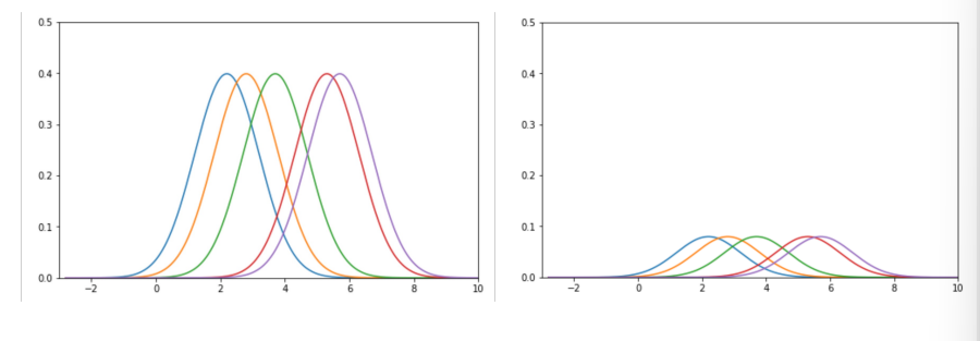
- 5 different kernals with area
1each - we want area =
1altogether \(\Rightarrow\) multiply each by \(1/5\)
- Sum Kernals
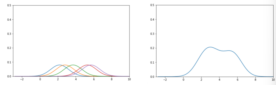
-
kernel density estimate = sum of the normalized kernels at each point
- \(\Rightarrow\) same result as
sns.distplot!
Kernals: valid density function
- must be non-negative for all inputs
- must integrate to 1
\(Gaussian\): most common kernal \[K_a(x, x_i) = \frac{1}{\sqrt{2\pi\alpha^2}}e^{-\frac{(x-x_i)^2}{2\alpha^2}}\]
- \(x\) : any input
- \(x_i\) : \(i^{th}\) observed value
- kernals cenetered on observed values \(\rightarrow\) mean of distribution = \(x_i\)
- \(bandwidth parameter = \alpha\) : controls smoothness of KDE
- also standard deviation of the Gaussian
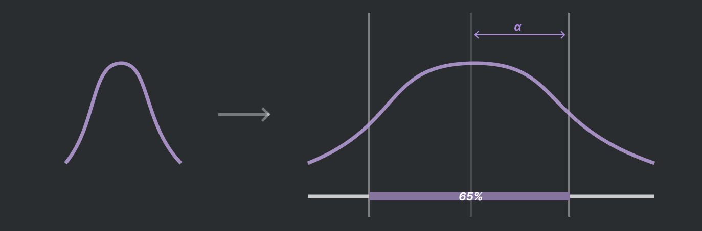
- also standard deviation of the Gaussian
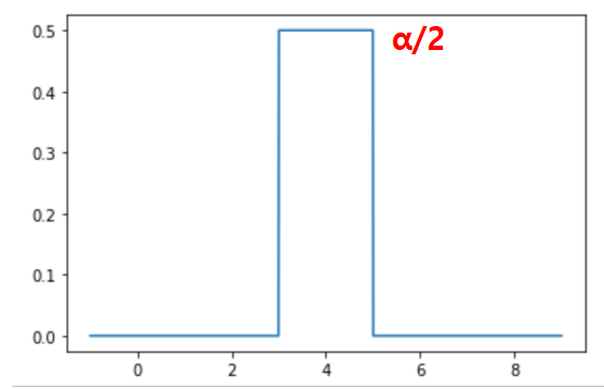
\(Boxcar\): another common kernal
- assign uniform density to points within ‘window’ of observation, 0 elsewehere
- resembles histogram \(K_a(x, x_i) = \begin{cases} \frac{1}{\alpha}, |x-x_i| <= \frac{a}{2}\\ 0, else \end{cases}\)
Bocar kernel centered on xi=4 with α = 2
 </div></details>
 Gaussian vs Boxcar
Effect of bandwidth on KDEs
- bandwidth \(\approx\) bin (in histogram)
KDE becomes smoother as \(\alpha\) increases
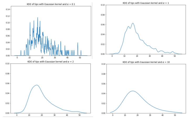
- simpler to understand, but gets rid of potentially important distributional information
- \(\alpha\) : hyperparameter
- Summary of KDE: \(f_\alpha(x) = \frac{1}{n}\sum_{i=1}^{n} K_\alpha(x, x_i)\)
- \(x\): any number on the number line (input to our function)
- \(n\): number of observed data points
- \(x_i (x_1, x_2,...,x_n)\) : observed data point (used to create KDE)
- \(\alpha\) : bandwidth or smoothing parameter
- \(K_\alpha(x, x_i)\) : kernal centered on observation \(i\)
- each kernal individaully has
area=1. We multiply by1/nso thattotal area=1
- each kernal individaully has
Transformation
- transforming data can reveal patterns
- ex: when distribution has large range,
loguseful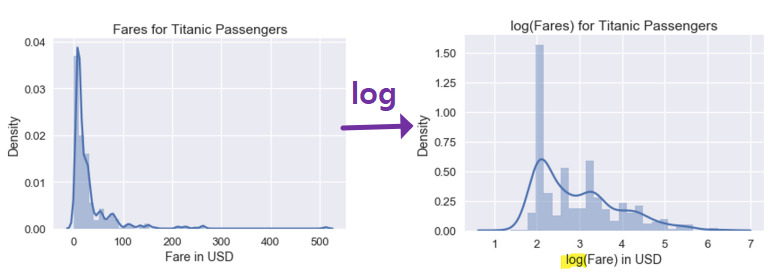
- ex: when distribution has large range,
linearize
- good because we can automatically known relationship between
xandy\(\Rightarrow\) simple to interpret
- good because we can automatically known relationship between
log review
- \(y = a^x\) \(\rightarrow \log (y) = x\log (a)\)
- \(y = ax^k\) \(\rightarrow \log (y) = \log (a) + k \log (x)\)
- Log of y-values
- \(\log y = ax+b\) \(\rightarrow \log y = ax+b \rightarrow y = e^{ax+b} \rightarrow y = e^{ax}e^b \rightarrow y = Ce^{ax}\)
- \(\Rightarrow\) exponential relationhip
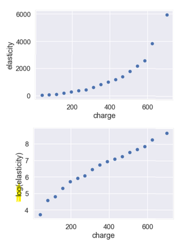
Log of x and y-values
- \[\log y = a \cdot \log x+b\] \[\rightarrow \log y = ax+b \rightarrow y = e^{a\cdot \log x+b} \rightarrow y = Ce^{a\cdot \log x} \rightarrow y = Cx^a\]
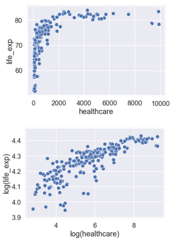
- \(\Rightarrow\) power relationhip (one-term polynomial)
- \[\log y = a \cdot \log x+b\] \[\rightarrow \log y = ax+b \rightarrow y = e^{a\cdot \log x+b} \rightarrow y = Ce^{a\cdot \log x} \rightarrow y = Cx^a\]
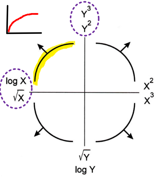
- Turkey-Mosteller Bulge Diagram
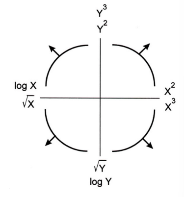
- following will help linearize
- multiple solutions exist, some will fit better than the others
- \(sqrt\) and \(log \rightarrow\)
smaller - \(power \rightarrow\)
bigger - these transformations will result in increasing / decreasing scale of axis
Example